Website design se lekar final launch tak pura process bahut smooth raha. Team har update time par deti rahi aur support bhi outstanding mila.

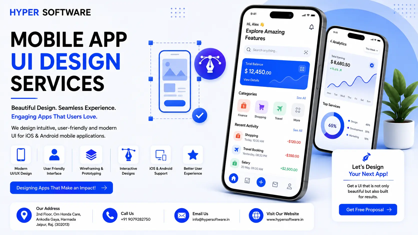
Most people uninstall an app within the first three days of downloading it. Not because the idea was bad. Because the interface made them think too ard. Mobile app UI design is thework that decides whether someone stays or taps that little trash-can icon — and at Hyper Software, we treat it that seriously.
Mobile app UI design is the process of designing everything a user sees and touches inside an app: the layout, the colors, the typography, the icons, the buttons, and the way one screen leads to the next. Done right, it's the difference between an app people tolerate and one they actually recommend to a friend.
We're an IT solutions company based in Jaipur, working with clients across India, the US, UK, and the Middle East. Below, we'll walk you through what obile app UI design actually involves, what it costs in 2026, and how we do it differently.
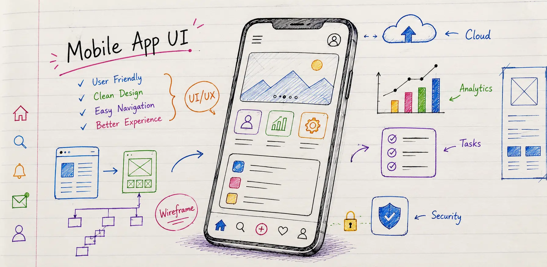
Mobile app UI (User Interface) design is the visual and interactive layer of a mobile app. It covers screen layouts, spacing, color systems, typography, cons, buttons, navigation bars, and the small animations that respond when you tap something.
It's easy to confuse UI with UX, so here's the simple version: UX decides how the app should work, and UI decides how it should look and feel while doing it. You need both, and neither one works well without the other.
A good UI designer doesn't start with colors. They start with a blank screen and a question: what is the single most important thing this user needs to do here? Everything else on the screen gets designed around that answer.
Get Free Consultation Within Minutes
Clients often use these words interchangeably, and that's fine — but it helps to know what each one actually produces.
| Term | What It Is | What It Looks Like |
| Wireframe | A rough, black-and-white skeleton | Boxes, placeholder text, no colors |
| showing layout and structure | ||
| UX (User | The logic behind how screens connect | Flowcharts, user journeys, |
| Experience) | and how tasks get completed | navigation maps |
| UI (User | The final visual layer — colors, type, | Polished screens that look like the |
| Interface) | icons, spacing | finished app |
| Prototype | A clickable version ofthe UI you can test | A working simulation you can tap |
| before development | through on your phone |
Skipping straight from an idea to final UI, without wireframes or a prototype, is one of the most common ways projects go over budget. Fixing a structural problem after development starts costs far more than fixing it on a wireframe.
A polished UI isn't a vanity project. It shows up directly in your numbers.
First impressions form fast. Users decide whether they trust your app within seconds of opening it.
Retention drops without clear design. Confusing navigation or cluttered screens are among the top reasons users abandon apps within the first week.
App store ratings depend on it. A clean, intuitive UI reduces support tickets and one-star reviews about "confusing" or "buggy" experiences.
It affects revenue directly. A checkout flow with unclear buttons or too many steps quietly loses sales every single day it stays unfixed.
We've seen founders spend their entire budget on backend features and treat design as an afterthought. It almost always backfires, because users never see your backend. They only see the screen in front of them.
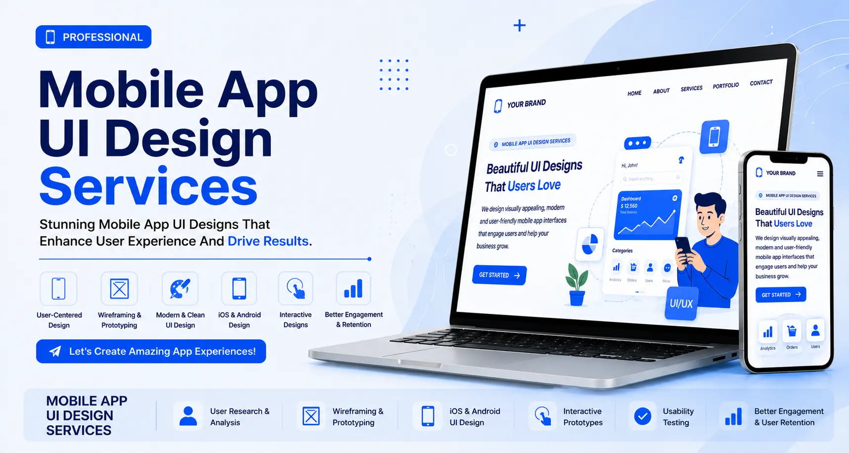
We don't jump straight into Figma the day you sign off. Here's the process we actually follow, stage by stage.
1. Discovery and research. We start by understanding your users, your competitors, and your business goals. We look at what similar apps get right and wrong, and we map out the core user flows before touching a single screen.
2. Wireframing. We build low-fidelity, black-and-white wireframes for every core screen.This is where we decide structure and hierarchy — not colors. Changes here take minutes. Changes after development takes weeks.
3.Interactive prototyping. We turn the wireframes into a clickable prototype in Figma, so you can tap through your app on your own phone before a single line of code exists. This is where usability issues surface, while they're still cheap to fix.
4. Visual UI design. Once the structure is approved, we apply your brand: colors, typography, icons, imagery, and micro-interactions. We design for iOS and Android separately at this stage, because the two platforms have different conventions.
5. Design system and developer handoff. We hand over organized, developer-ready files with a documented design system — reusable components, spacing rules, and color tokens — so your developers build exactly what was designed, and future features stay consistent.
6. Testing and refinement. We run the prototype past real users where possible, catch friction points, and refine before handoff. Design isn't done until people can use it without confusion.
A logistics startup came to us with a working app that nobody wanted to use. Drivers were skipping steps in the delivery confirmation flow because it took too many taps, and support tickets about "the app freezing" were really just users getting stuck on a confusing screen.
We ran a short discovery session with their operations team, mapped the actual delivery workflow on paper, and found the confirmation flow had six screens where two would do.We rebuilt it as a wireframe first, tested it with three actual drivers, then designed the final UI with bigger touch targets for use in gloves and bright sunlight.
Within the first month after launch, their support tickets related to the delivery flow dropped by more than half, and drivers reported the app "finally made sense." Nothing about their backend changed. Only the interface did.
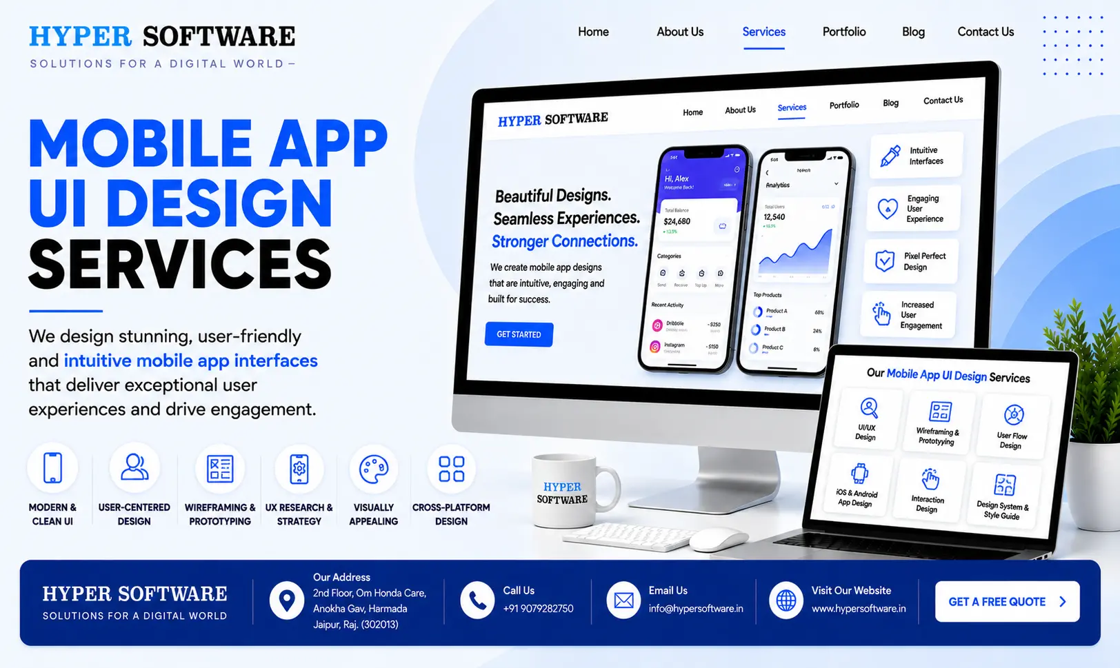
Cost is the question everyone asks first, and fair enough — it varies a lot depending on scope. Here's a realistic breakdown for 2026.
| App Complexity | Screens (Approx.) | Typical Cost Range |
| Simple MVP (basic app, few features) | 8–15 | $2,000 – $8,000 |
| Mid-size app (multiple user flows, custom UI) | 15–30 | $8,000 – $20,000 |
| Complex app (enterprise, multi-role, animations) | 30–60+ | $20,000 – $45,000+ |
Hourly rates for UI/UX design services vary widely by region — generally lower in India and South Asia, and considerably higher in the US, UK, and Australia. This is one reason many global businesses partner with agencies based in India: the quality bar stays high while the cost stays predictable.
Plenty of founders start by designing their own app in a free tool, and for a very early prototype, that's a reasonable place to start.
When DIY makes sense:
When it stops working:
What can go wrong doing it alone: templated designs often ignore platform-specific patterns (like iOS swipe gestures orAndroid's back button behavior), touch targets end up too small for real thumbs, and there's no design system, so every new feature looks slightly different from the last. None of these show up until real users start complaining.
Figma — our primary tool for wireframes, prototypes, and final UI, chosen for its collaboration features and developer handoff tools.
FigJam / Miro — for early user flow mapping and brainstorming with your team. Principle / ProtoPie — for complex micro-interactions and animations that need to be shown precisely to developers.
Material Theme Builder — for building a consistent Android color system from your brand colors.
Maze / UsabilityHub — for lightweight usability testing on prototypes before development starts.
Trends shift fast, but a few patterns are proving genuinely useful this year rather than just looking good in a portfolio shot:
Thumb-friendly layouts. Primary actions are moving toward the bottom half of thescreen, where thumbs naturally reach, rather than the top.
Bottom-sheet navigation. Draggable panels anchored to the screen's bottom are replacing full-screen takeovers for filters, settings, and confirmations.
Dark mode as standard, not an afterthought. Users expect a properly designed dark theme, not just an inverted color scheme.
Adaptive interfaces. Apps with genuinely different use cases (like banking or fitness apps) are starting to reorder content based on what a user does most often.
Passwordless and passkey login. Simpler, faster authentication is replacing long password flows.
Accessible-by-default design. Larger touch targets, proper contrast ratios, and support for dynamic font sizes are becoming baseline expectations, not extras.
Chasing every trend isn't the goal. The point is to pick the ones that reduce friction for your specific users, and skip the ones that only look good in a design showcase.
| Element | iOS (Apple Human Interface Guidelines) | Android (Material Design) | |
| Navigation | Tab bar at bottom, back gesture from screen edge | Bottom navigation or navigation drawer, dedicated back button | |
| Typography | San Francisco font family | Roboto or custom Material fonts | |
| Buttons | Rounded, minimal shadows | Elevated buttons with more pronounced shadows | |
| Icons | Thinner line-based icons (SF Symbols) | Bolder, filled Material icons | |
| Depth | Subtle blur and translucency | Layered elevation with shadow depth |
We design for each platform on its own terms rather than forcing one visual style onto both, because users notice when an app feels "off" for their phone, even if they can't say exactly why.
Mobile app UI design is the process of designing the visual interface of a mobile app — screens, colors, typography, icons, and nteractions — so the app is easy and pleasant to use.
UI design focuses on how the app looks and feels; UX design focuses on how the app works and how users move through it. Both work together on every screen.
Costs typically range from $2,000 for a simple MVP to $45,000+ for a complex, multi-platform enterprise app, depending on screen count and complexity.
Simple apps take 2–4 weeks, mid-size apps take 6–10 weeks, and complex apps can take 3–6 months from research to developer handoff.
Yes. We design native experiences for each platform's guidelines, while keeping a consistent design system across both.
Typically wireframes, an interactive prototype, high-fidelity UI screens, a design system, and developer-ready handoff files.
Yes. We start with a UX audit of your current app, identify friction points, and redesign only what needs improvement.
We primarily use Figma for design and prototyping, along with tools like Principle for complex animations and Maze for usability testing.
Yes. Skipping wireframes almost always leads to expensive structural changes later, once development has already started.
A design system is a reusable library of components, colors, and rules. It's worth it for any app that will keep adding features after launch.
We've been building website UI design, software, and mobile apps for clients across the world since 2020, from our base in Jaipur. Our design team doesn't hand you a set of pretty screens and disappear — we stay through wireframes, prototypes, developer handoff, and the inevitable round of "can we tweak this one thing" after you see it live.
Working with a team based in India means you get senior-level design thinking at a cost that doesn't require an enterprise budget, without cutting corners on research or testing.
Ready to design an app people actually want to use? Call us at +91 9079282750 or visit www.hypersoftware.in to get a free quote.
No. UI design creates the visual layout and look of the app; development is the actual coding that makes it work.
Yes, for a simple MVP using free tools like Figma's community templates, though it has real limits once your app grows past a handful of screens.
A simple app typically takes 2–4 weeks; a mid-size app takes 6–10 weeks; complex, multi-role apps can take 3–6 months.
Not always, but for the best user experience, each platform's navigation and visual conventions should be respected, even within a shared design system.
Figma is the current industry standard, alongside tools like Principle or ProtoPie for advanced animations.
Have questions or need expert guidance? Our team is ready to help you with the right technology solutions for your business.