Business website bilkul premium quality ki bani hai. Mobile responsive design aur clean layout ki wajah se customer experience bahut achha ho gaya. Highly recommended.

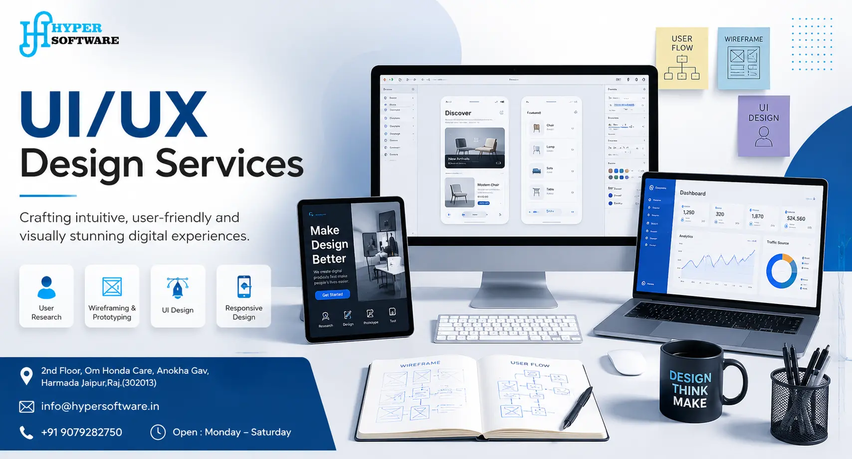
Most businesses don't lose customers because their product looks bad. They lose them because their product is confusing. A user hits a form they don't understand, a button that doesn't do what it looks like it should, or a checkout page with one extra step too many, and they leave. That's not a marketing problem. That's a UI/UX design problem.
UI/UX design is the process of researching how real people use your product, then shaping its layout, flow, and visuals so using it feels obvious instead of frustrating. Done right, it's the difference between a visitor who bounces in ten seconds and one who becomes a customer. At Hyper Software, we design interfaces for websites, mobile apps, SaaS platforms, and e-commerce stores for clients across the globe, and we build every project around one question: will a real user actually understand this without help?
This page covers what UI/UX design actually means, what it costs, how our process works, and the mistakes that quietly cost businesses the most oney. If you've ever wonderedwhether you can just skip this step, stick around for that section too. We'll be honest about it.
UI/UX design is two connected disciplines. UI (user interface) design is everything you see and touch on a screen: buttons, colors, fonts, icons, spacing. UX (user experience) design is everything you feel while using it: whether the sign-up flow makes sense, whether you can find the search bar, whether the checkout process feels like it's fighting you.
Get Free Consultation Within Minutes
Think of it like a building. UX is the architecture: where the doors go, how many steps it takes to reach the kitchen, whether the layout makes sense for the people living there. UI is the paint, the light fixtures, the door handles. You need a solid layout before the finishing touches matter, and the finishing touches are what make people want to walk in at all.
Neither one works without the other. A gorgeous app that confuses users will still fail. A perfectly logical app that looks like it was built in 2009 will lose users to a competitor that looks trustworthy.
Good design isn't decoration. It's a business decision with measurable outcomes.
None of this needs to be taken on faith. Companies that invest properly in design capability consistently report stronger revenue growth and shareholder returns than those that treat design as an afterthought, according to widely cited research from McKinsey's Design Value Index.
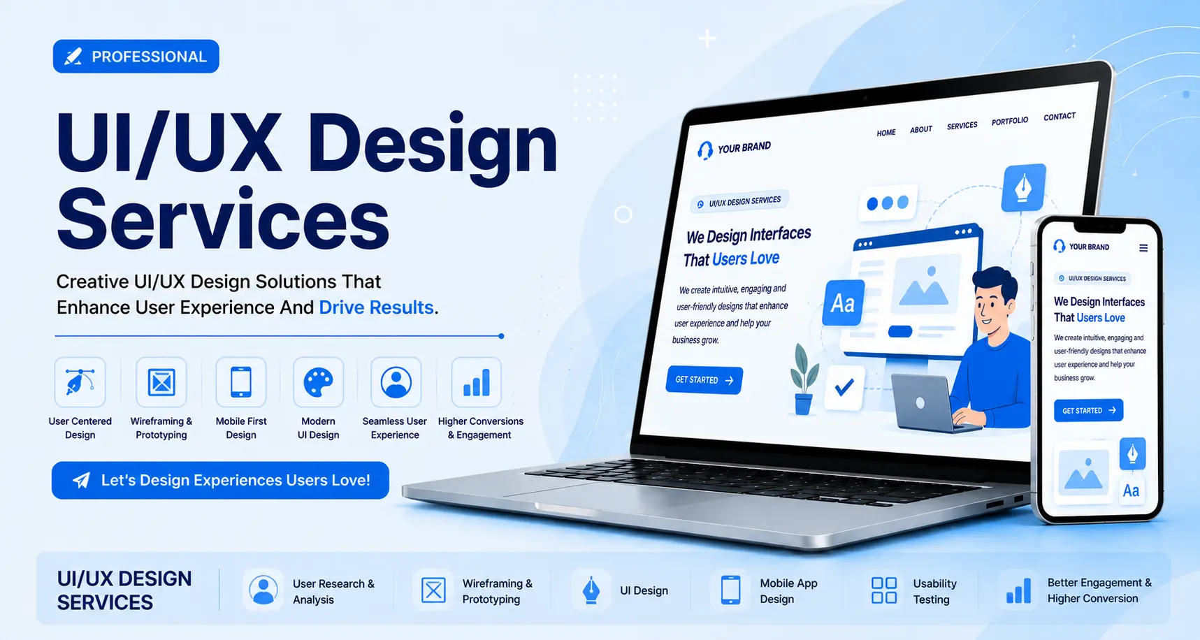
This is one of the most searched questions in the entire industry, and for good reason: the terms get used interchangeably, but they're not the same job.
| UI Design | UX Design | |
| Focuses on | How it looks | How it works |
| Deals with | Colors, typography, icons, layout, visual hierarchy | User research, information architecture, user flows, usability |
| Key | Does this look clear and appealing? | Can a user complete their task without |
| question | confusion? | |
| Comes first | After UX groundwork is laid | Before visual design begins |
| Tools used | Figma, Adobe XD, Sketch | User interviews, journey maps, wireframes, |
| usability tests |
A simple way to remember it: if a button is the wrong color, that's a UI problem. If a user can't find the button at all, that's a UX problem.
We don't start by opening Figma and making screens. We start by understanding your users, your business goals, and where things are currentlyreaking down. Here's how a typical project runs.
1. Discovery and User Research
We talk to you, and where possible, we talk to your actual users. We look at analytics, support tickets, and drop-off points if you already have a live roduct. This step tells us what's actually broken, not what we assume is broken.
2.Information Architecture and Wireframing
Before anything looks pretty, we map out the structure: what pages exist, how users move between them, what happens at each decision point. Wireframes are deliberately plain at this stage. Getting the client to approve structure before color keeps revisions cheap.
3. Visual (UI) Design
Once the flow is approved, we apply your brand: colors, typography, icons, spacing, and visual hierarchy. This is where the product starts to look like a finished experience.
4.Interactive Prototyping
We build a clickable prototype so you (and, where possible, real test users) can experience the flow before a single line of code gets written. This is the cheapest point in the whole project to catch a mistake.
5. Usability Testing and Handoff
We test the prototype with real users where budget allows, refine based on what we see, then hand off developer-ready files with specs, assets, and a component library so your development team (or ours) can build it accurately.
We don't disappear after handoff either. Post-launch, we recommend a short review cycle once real usage data comes in, because the version that tested well with five people in a lab often needs small tweaks once thousands of real users touch it.

Website UI/UX Design
From marketing sites to complex web applications, we design layouts that guide visitors toward the action you actually want them to take, whether that's a purchase, a form fill, or ademo request.
Mobile App UI/UX Design
iOS and Android interfaces built around how people actually hold and use their phones: thumb-friendly navigation, clear onboarding, and screens that don't force users to pinch and zoom to read anything.
SaaS and Dashboard Design
Dashboards fail when they try to show everything at once. We design SaaS interfaces around the tasks users do most often, and tuck everything else one deliberate step away.
E-commerce UI/UX Design
Product pages, cart flows, and checkout experiences designed to reduce abandonment,with particular attention to mobile checkout, since that's where most drop-off happens.
Design Systems
A component library and style guide so your product stays visually consistent as new features and screens get added, without every new page needing a design review from scratch.
UX Audits and Usability Testing
Already have a live product that isn't performing? We review it against usability heuristics,Nielsen Norman Group — UX Research, real analytics, and (where possible) real user testing sessions, then hand you a prioritized list of what to fix first.
This is one of the most common questions we get, and one of the most avoided answers across the industry. Here's an honest breakdown based on urrent global market rates in
| Project Type | Freelancer Cost | Agency Cost |
| Landing page or single-screen design | $150 – $1,500 | $1,000 – $5,000 |
| Small business website UI/UX | $1,000 – $8,000 | $3,000 – $15,000 |
| Mobile app UI/UX (15–25 screens) | $8,000 – $25,000 | $15,000 – $40,000 |
| SaaS MVP design | $10,000 – $30,000 | $15,000 – $60,000 |
| Enterprise platform / design system | $30,000+ | $60,000 – $150,000+ |
Hourly rates vary widely by region. Freelancers typically charge $20–$50/hour for junior-level work and $80–$150/hour for senior specialists. Agencies in the US and Western Europe generally bill $100–$300/hour, while agencies in India and other parts of Asia typically bill $20–$80/hour for comparable quality, which is one reason many global businesses now work with design teams outside their home country.
Trends shouldn't drive your design decisions, but ignoring them means your product starts to feel dated fast. Here's what's actually showing up in production work this year, not just concept boards.
AI-assisted design workflows. Tools now generate layouts from a team's real component library instead of generic templates, speeding up production without replacing designer judgment.
Progressive disclosure. Interfaces show only what a user needs for the current task, and tuck everything else one step away. This has become tandard in SaaS and enterprise tools that used to dump every option on screen at once.
Accessibility as a baseline, not an afterthought. WCAG compliance, screen reader support, and designing for different types of cognitive processing are now expected, not optional extras.
Conversational and voice-first interfaces. Natural-language interaction is handling complete workflows in some products, not just simple FAQ lookups.
Design systems as governance, not just a style guide. Larger teams use design tokens and code-backed components so consistency scales utomatically as new features ship.
Ethical, transparent design. Clear data usage, easy opt-outs, and honest interfaces are becoming a genuine competitive advantage as users grow more selective about who they trust with their data.
Our take: chase the trends that reduce friction for your specific users. Skip the ones that exist purely to look impressive in a portfolio.
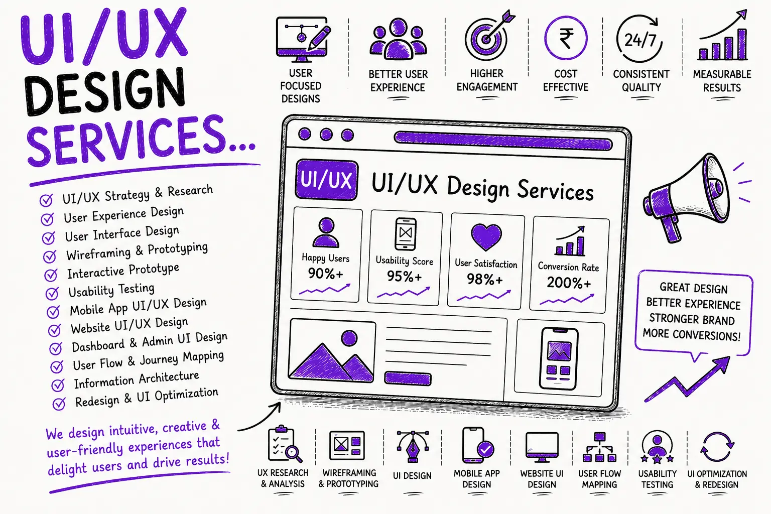
We've inherited more than one project that started somewhere else and came to us after things went wrong. The same handful of mistakes show up again and again.
Skipping research and going straight to visuals. A beautiful screen built on a wrong assumption about users is still wrong.
Bringing designers in after development has already started. By then, the major structural decisions are locked, and design becomes cosmetic instead of strategic.
Choosing the cheapest quote without checking process. A rock-bottom price usually means no research, no testing, and a design that looks fine in a screenshot but falls apart in real use.
Using icons with no label, assuming users will "just get it." The same icon means different things to different people, especially across cultures and industries.
No plan for feedback after launch. Design isn't a one-time delivery. Products that never get revisited based on real usage data quietly get worse over time as new features get bolted on.
Treating the design team like an outside vendor instead of a partner. Projects that succeed usually involve regular check-ins, not a brief handed over and picked up six weeks later.
A mid-size online retailer came to us with a problem they couldn't quite name. Traffic was healthy. Conversions weren't. Their checkout flow had been built by their development team directly, without any dedicated UX work, and it technically functioned. Customers just weren't finishing purchases.
We started with a UX audit: reviewing analytics, running a handful of usability sessions, and mapping the actual checkout flow screen by screen. The problem turned out to be simple but costly. The shipping cost only appeared on the final step, after the customer had already entered their card details, and there was no visible progress indicator showing how many steps were left.
We redesigned the flow around two changes: showing estimated shipping cost on the cart page instead of hiding it until checkout, and adding a simple three-step progress bar so users always knew how much was left. We tested the new flow with a small group before full rollout, adjusted the button copy based on what confused testers, and handed off developer-ready screens with a lightweight component library so future changes wouldn't need a full redesign.
Cart abandonment dropped noticeably within the first month after launch. Nothing about the product changed. The way users experienced it did.
Yes, for early-stage prototypes or personal projects, especially using free tools like Figma. Once real customers or revenue are involved, the risk of a confusing flow usually costs more than hiring it out properly.
Typical deliverables include user research findings, wireframes, high-fidelity UI screens, an interactive prototype, and developer-ready design files, often along with a basic component library or style guide.
Figma is the current industry standard for design and prototyping. Teams also use tools for user testing, analytics review, and design systems, along with AI-assisted design tools for speeding up early drafts.
It directly affects conversion rates, customer retention, and support costs. A confusing interface loses customers quietly, often without the business realizing that's the reason behind weak numbers.
A UX audit is a review of an existing website or app to find where users are getting confused or dropping off, based on analytics, usability heuristics, and sometimes direct user testing. It ends with a prioritized list of fixes.
Freelancers are usually more affordable and work well for smaller, well-defined projects. Agencies bring a full team (research, design, testing) and are generally a better fit for anything customer-facing or tied to revenue.
Skipping user research and jumping straight into visual design. It leads to a product that looks polished but doesn't actually solve the user's real problem, which is usually discovered only after launch.
Yes. Reducing friction in a checkout or sign-up flow is one of the most reliable ways to increase completed purchases or sign-ups, since most abandonment happens at points of confusion, not lack of interest.
A design system is a shared library of reusable components (buttons, forms, colors, typography rules) that keeps a product visually and functionally consistent as new features get added over time.
Yes. Most UI/UX design work happens entirely through screen-sharing calls, shared design files, and async feedback tools, so location is rarely a real barrier as long as communication is clear and time zones are managed well.
Founded in 2020 and based in Jaipur, Rajasthan, Hyper Software has worked with businesses across industries and across the globe on websites, custom software, mobile apps, e-commerce platforms, and design work that actually gets used, not just admired.
Here's what that looks like in practice:
We work with the tools the industry actually relies on for production work: Figma for design and prototyping, graphic design systems and component libraries for consistency at scale, and usability testing tools for gathering real user feedback before launch. We also use AI-assisted design tools where they genuinely speed up production, but every layout goes through human review before it ships. AI can generate options. It can't make a judgment call about your specific users, and we don't let it try.
We've designed for e-commerce, SaaS platforms, healthcare-adjacent tools, fintech-style dashboards, education platforms, and standard business ebsites. Every industry has its own quirks. A healthcare interface needs more caution around clarity and compliance than a marketing landing page does. We adjust our process depth accordingly rather than applying one template to every client.
UI/UX design is the process of making a website or app both easy to use (UX) and pleasant to look at (UI). It combines research, tructure, and visual design so a product works the way real people expect it to.
UI design is what you see: colors, buttons, layout. UX design is how the product works and feels while you're using it, including navigation, flow, and overall ease of use. Good products need both working together.
You need both. UX without UI often looks unfinished and won't build trust. UI without UX can look great but confuse users at the exact moment they're trying to buy something or complete a task.
In 2026, a single landing page can cost as little as $150 with a freelancer, while a full SaaS platform with a specialist agency can run $30,000 to $150,000 or more. Cost depends mainly on the number of screens, whether research and testing are included, and team location.
A simple website design usually takes 2 to 4 weeks. A larger app or SaaS product with proper research and testing can take 8 to 16 weeks or longer, depending on complexity.
Have questions or need expert guidance? Our team is ready to help you with the right technology solutions for your business.